







CASE STUDY
Wellness Studio Website Design
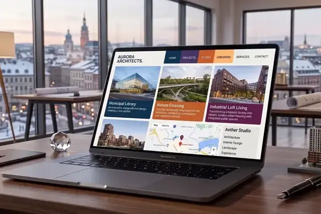
Aurora Architects opened with a beautiful room and a placeholder site that felt clinical and cold. The new brand and website now feel the way the studio feels the moment you walk in, calm and considered throughout.
- Calm, spacious brand identity
- One guided path to booking
- One system from print to screen
THE CHALLENGE
Where it started
Aurora Architects is a brand and web project for a wellness studio that opened with a beautiful room and a placeholder site that felt clinical and cold, the opposite of what a visitor feels the moment they actually walk in. The studio wanted its digital presence to feel as calm and considered as the physical space, not a generic booking page added on top of a genuinely nice interior.
The brief was simple to state and easy to get wrong: make the website feel the way the studio feels in person. That meant building a full brand system, not only a homepage, one that could carry from print materials through to the screen without ever losing the tone.
WHAT THEY NEEDED
A wellness studio needs a site as calm as the room it leads to.
A studio that opened with a considered physical space needed a full identity built around it, not a homepage simply layered on top of a placeholder brand left over from before.
Every page needs to guide a visitor gently toward a booking without competing elements or clutter working against the calm the studio is actively trying to create in the room and online.
The brand needs to carry consistently from printed materials into the website itself, so the studio reads as one considered identity wherever a client happens to encounter it first, in a brochure or on a phone.
Aurora ArchitectsBrand, Web DesignSTRATEGY & EXECUTION
Here is what we built for Aurora Architects.
Soft, Spacious Identity
The new identity is built around generous whitespace, slow motion and warm imagery, staying quiet and premium rather than leaning on the usual wellness industry cliches of pastel color palettes and stock serenity photography found everywhere else in the category, studio after studio, season after season and year after year across the whole industry, with no exception.
One Calm Path To Booking
Every page guides visitors gently from interest all the way to a booking, with a single path and nothing competing for attention, so the experience online matches the unhurried feeling of the physical space itself, room by room and page by page, from the first click onward to the final confirmed booking on the calendar.
Unified Print And Screen System
The brand carries consistently from print materials to the website as one cohesive system, so a client encountering either one instantly recognizes the same considered identity behind both of them, wherever they see it first, in hand or on screen, at home or in the studio itself, morning or evening alike, any day of the week.
Booking Built Into The Calm
Booking is woven gently into the pacing of the site rather than interrupting it with an urgent call to action, so acting feels like a natural next step instead of a sudden sales push at the wrong moment in a visitor's day or their visit to the studio itself in person, room by room and hour by hour.
Warm Imagery Over Stock Serenity
Photography and motion were chosen to feel warm and specific to this particular studio, avoiding the generic wellness imagery that makes most studios in the category look completely interchangeable with one another online, studio after studio, page after page, season after season and year after year without change or variation of any real kind, ever.
Inside the build
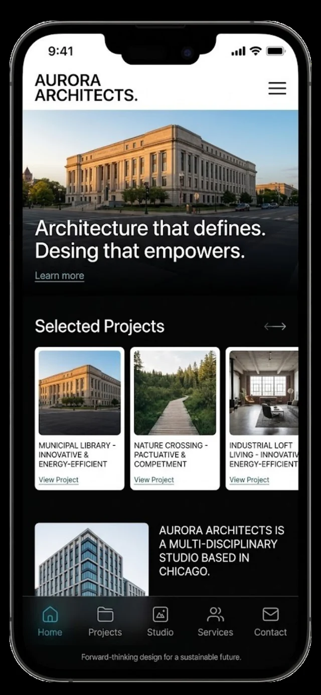
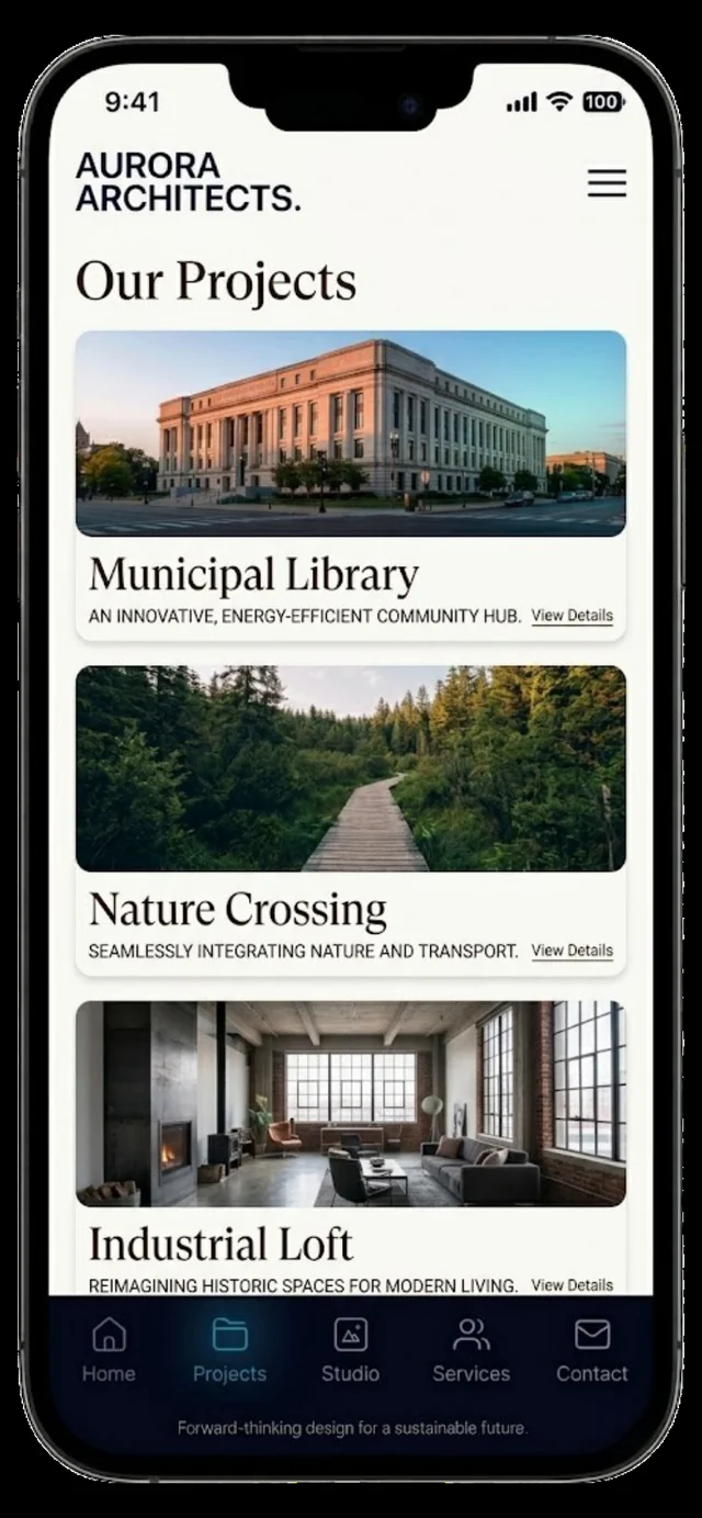
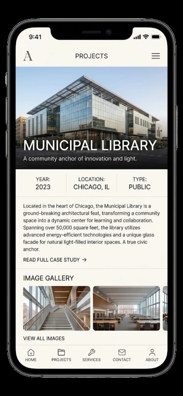
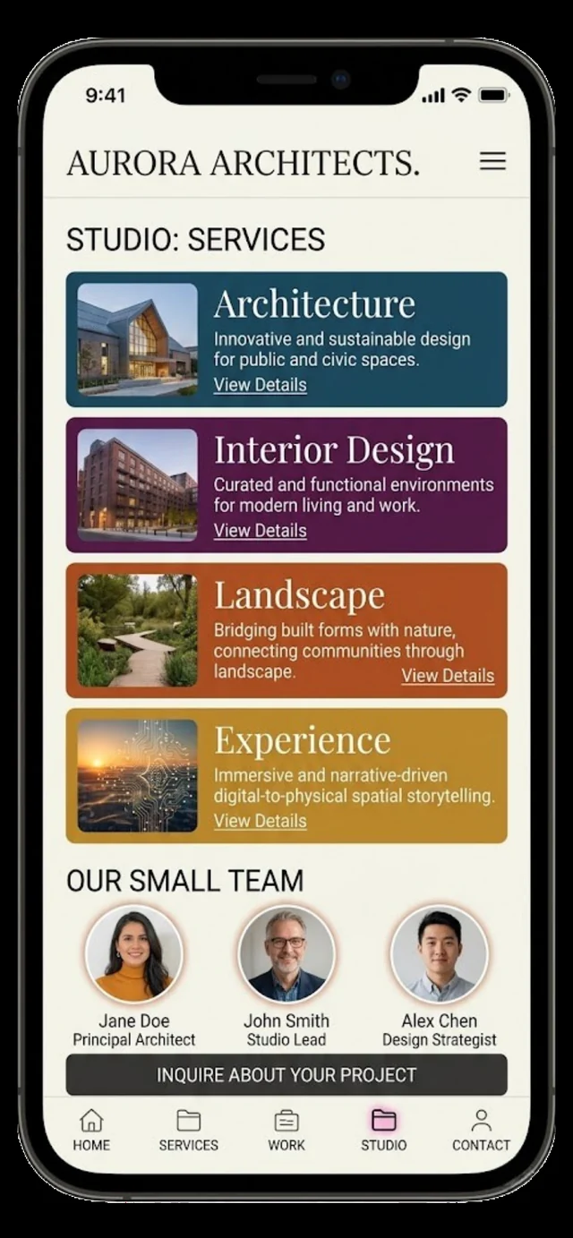
Scroll through the Aurora Architects build, screen by screen.
Responsive on Every Screen
Built for Speed
Designed to Convert
Search-Ready From Day One
The site adapts cleanly from desktop to tablet to phone, staying readable and deliberate on whatever device your visitors reach for.
Optimised images, lean code, and careful loading keep the experience fast and Core Web Vitals in the green, so nothing bounces.
Clear hierarchy and well-placed calls to action guide visitors toward the next step, turning casual browsing into real enquiries.
A technically sound foundation with clean structure and metadata helps the site get found and rank for the terms that matter.
THE RESULT
Bookings now start online with the same ease members feel in the room.
A Brand That Matches
The site finally carries the same calm, considered feeling as the physical studio, instead of a generic placeholder simply layered on top of it as before the studio opened its doors.
One Calm Path
Visitors move gently from interest all the way to booking along a single path, with nothing competing for their attention anywhere along the way to the form or the calendar.
One System, Print To Screen
The brand now reads exactly the same whether a client sees it in print or on the site, carried through consistently as one cohesive identity, piece by piece and page by page.
A Studio That Looks Right
The digital presence now matches the in person experience, calm by design rather than styled after the wellness category's usual generic look and feel found everywhere else in the industry.
Services behind this project
FAQ'S
Questions about the Aurora Architects project.
How long does it take to build a brand and website together for a wellness studio?
Most websites launch in about 7 days, and online stores in about 10. A combined brand and website project like Aurora Architects' covers the identity system, the calm single path to booking and carrying the brand consistently from print materials through to the finished site, ready to greet the first member the day it opens.
Can a website brand be designed to carry over into print materials too?
Yes. Aurora Architects' identity was built as one complete system meant to carry from print through to screen, so the studio reads as the same considered brand whether a client sees a printed piece or the website itself, in the room or online, on paper or on a phone in their hand.
How do you make a booking site feel calm instead of pushy?
By weaving the booking step gently into the pacing of the page instead of interrupting it with an urgent call to action. Aurora Architects' site guides visitors along one calm path where booking feels like the natural next step, not a sudden sales push at the wrong time in the visit.



BUILD YOURS
Get a brand and website that feel like your space does in person.
We build the identity and the site as one system, from print through to the booking page. Most websites launch in about 7 days, and online stores in about 10.