Web Design
How to Design a Homepage That Converts in the First Five Seconds
The layout, hierarchy and proof decisions that turn cold traffic into qualified leads in seconds.
When Northbound Coffee Co. came to Rankwyre, the cold brew was excellent but the website did not do it justice. Visitors bought a can once and rarely came back, and the subscription that should have driven repeat revenue barely moved.
This case study covers what the redesign changed at a strategic level, why each decision mattered, and the result Rankwyre delivered over the following quarter.
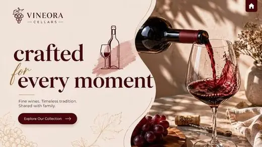
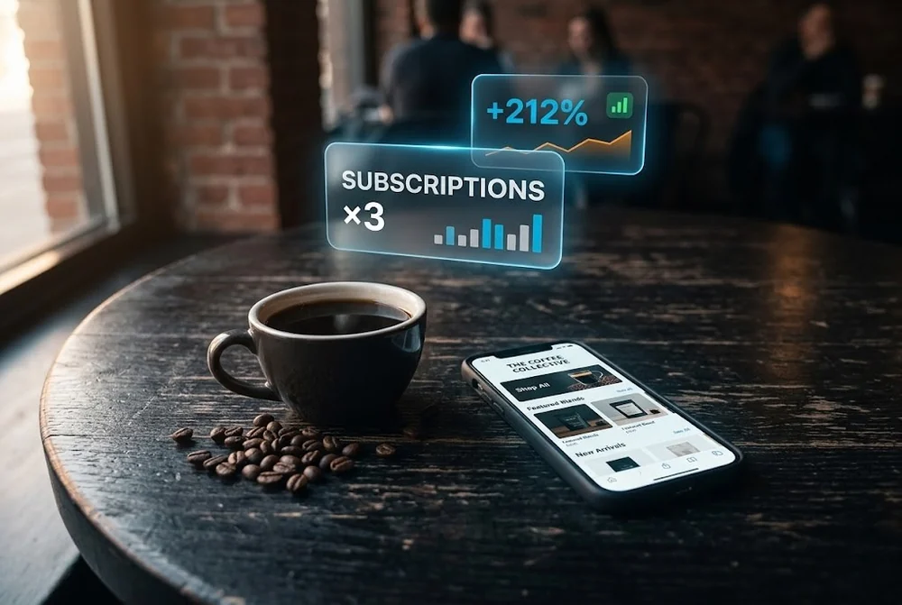
Northbound Coffee Co. tripled subscription signups after Rankwyre sharpened its positioning, built a packaging led visual system, and rebuilt the store around one clear path to subscribe. The redesign was not about a new logo, it was about making the brand feel premium and the next order effortless.
The original site looked like a generic template and treated a premium cold brew like a commodity. Nothing on the page communicated why Northbound was worth choosing over the can beside it on the shelf.
Most visitors made a single purchase and left. The subscription option existed, but its value was buried, so the brand was leaving its most profitable customers on the table.
Rankwyre started with positioning, not pixels. We anchored the brand around its strongest ideas, bold flavour, slow steeped quality, and energy you can reach for anytime, then built a visual system that carried that story across every page.
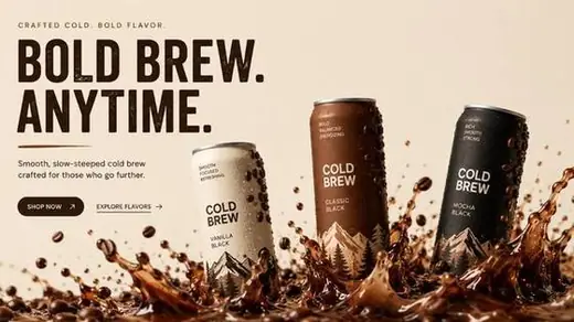
The packaging did the heavy lifting. We pulled the palette, mountain motif and confident type straight from the cans, so the site felt like an extension of the product in your hand.
A premium product deserves an effortless path to buy again. We made the subscription the hero of the experience, explained its value in plain language, save money and never run out, and removed the friction that had been hiding it.
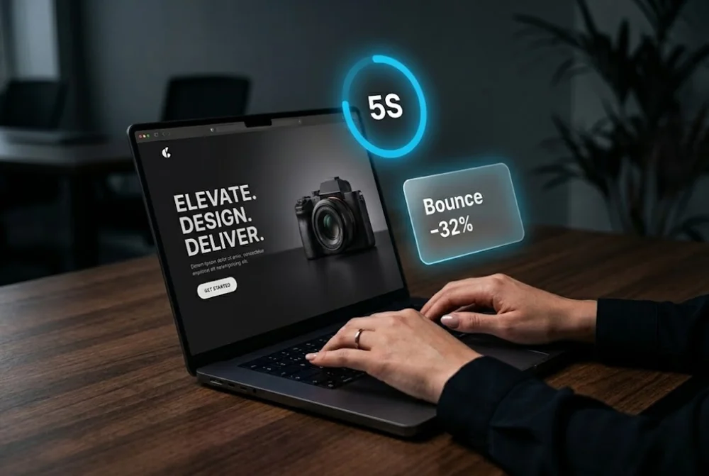
Across the store, every page pointed toward one confident next step. Clearer product storytelling and visible trust signals did the rest, turning first time curiosity into repeat orders.
Within one quarter, subscription signups roughly tripled and repeat revenue grew with them, all without spending more to acquire traffic.
The takeaway is one Rankwyre sees again and again. When a brand finally looks as good as the product, and the next purchase feels effortless, growth follows.
A focused redesign of a direct to consumer store typically runs four to eight weeks depending on the catalogue size and how ready the content is. Positioning and brand work often take as long as the build, which is why Rankwyre starts there.
Not when it is handled correctly. Preserving URLs, redirecting any that change and keeping content depth protects your search visibility, and a clearer, faster store usually lifts both rankings and conversion.
They work together. A premium brand earns the first yes, and a frictionless store turns that into a recurring subscription. Rankwyre designs both so repeat revenue becomes the default, not the exception.
The layout, hierarchy and proof decisions that turn cold traffic into qualified leads in seconds.
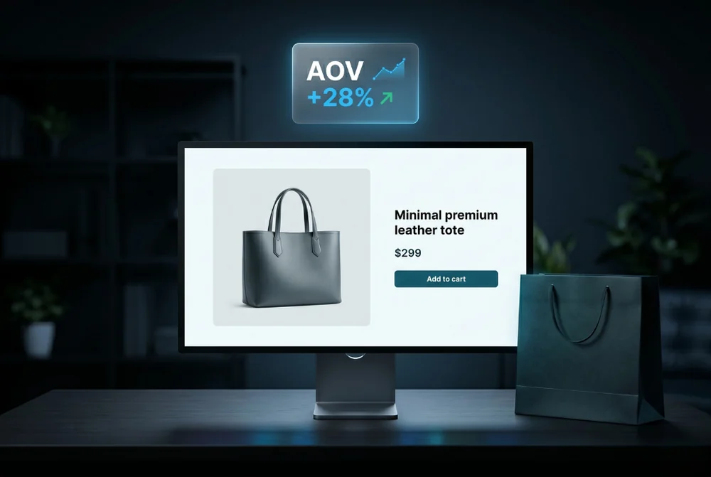
How product page design, merchandising and trust signals lifted average order value.

Copy, placement and contrast for calls to action that lift your click through rate.
From first sketch to launch day, we design sites that look unforgettable and convert like they mean it.