Conversion
How to Write Call to Action Copy People Actually Click
Copy, placement and contrast for calls to action that lift your click through rate.

Most visitors decide whether to stay or leave before they finish reading a single sentence. That judgement rests on layout, clarity and a gut sense of credibility, not on the clever copy three scrolls down. If your homepage does not make its case quickly, the rest of the page rarely gets a chance.
This web design guide breaks down the decisions that matter in those opening seconds, and how Rankwyre structures a homepage so the right message lands before attention runs out.
To convert in the first five seconds, a homepage must answer three questions before the visitor scrolls: what you do, who it is for, and why you are the credible choice. Lead with a benefit driven headline, show one primary call to action, and surface one piece of visible proof. Everything else can wait.
The first screen a visitor sees, before any scrolling, still carries the most weight, even on long pages. So it has to answer three questions without making the visitor think:
When all three are present the visitor relaxes and keeps reading. When one is missing they hesitate, and hesitation is where bounces happen.
The fastest way to lose a visitor is to open with a sentence about how innovative your company is. Visitors arrive with a problem and they want to know you can solve it. A benefit driven headline names the outcome they want in language they already use.
Write the headline around the result, then support it with a one line subhead that explains how you deliver it. Rankwyre tests headline variants against real search intent so the words on the page match the words people typed to find it.
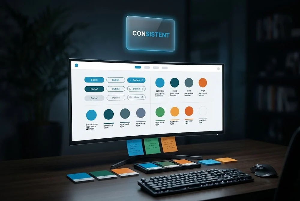
A homepage with five competing buttons has no primary action at all. Choose one conversion goal for the page, make that call to action the brightest element on the first screen, and repeat it as the visitor scrolls.
Secondary links can exist, but they should be visually quieter. The job of layout is to remove choices, not add them, so the path from first glance to click feels obvious.
Trust is built faster with evidence than with adjectives. Logos of recognisable clients, a specific metric, a short testimonial with a real name and face, these do more in one second than a paragraph of claims.
Place at least one proof element where it is visible immediately, then layer the rest down the page as interest grows. Proof near the call to action lifts conversion because it answers the doubt right when the visitor is deciding.
Research on web behaviour consistently shows that visitors form an impression of a page in well under a second and decide whether to stay within the first few seconds. Treat the first five seconds as the window in which your value must be obvious.
Yes. Your primary call to action should be visible without scrolling, restate the benefit rather than a generic label like submit, and repeat consistently further down the page so it is always within reach when the visitor is ready.
Leading with a brand statement instead of a customer outcome. Visitors care about what they will get, not how innovative you believe your company to be. Rewrite the headline around the result the customer wants.
From first sketch to launch day, we design sites that look unforgettable and convert like they mean it.