Web Design
Web Animation That Guides Users Instead of Distracting Them
Principles for fast, purposeful micro interactions and motion that never distracts.
A design system is meant to make a growing website faster to build and easier to keep consistent. Done badly it becomes a museum of unused components that nobody trusts.
This guide explains how Rankwyre builds design systems that teams actually use, so a site stays coherent as pages and contributors multiply.
A maintainable design system is built on a small set of tokens for colour, type and spacing, a focused library of reusable components, and clear naming conventions. Start small, document the rules, and grow the system only when a real pattern repeats.
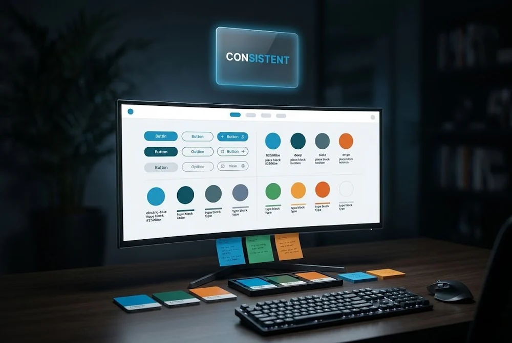
Tokens are the smallest decisions in your system: the palette, the type scale, spacing steps, radius and shadow. Everything else is built from them.
Define a limited set and resist exceptions. When colour and spacing come from a fixed scale, every new page inherits consistency for free, and a single change updates the whole site.
Do not design components in the abstract. Wait until a pattern appears two or three times across real pages, then turn it into a reusable component with clear variants.
A focused library of buttons, cards, sections and form fields covers most of a marketing site. Fewer, well made components beat a sprawling library that nobody can navigate.
Naming is where most systems quietly fall apart. Use names that describe purpose, not appearance, so button primary survives a colour change while button blue does not.
Agree on a simple convention, write it down, and apply it everywhere. Consistent names make the system searchable and lower the cost of every future change.
A short living document that shows each token and component, with a sentence on when to use it, is worth more than a perfect but unread spec.
Let the system grow only when a genuine new pattern repeats. A maintainable design system stays small on purpose, which is exactly why a team keeps using it.
As soon as more than one person edits it, or it passes roughly ten to fifteen pages. Even a lightweight system of tokens and a handful of components prevents the drift that makes a growing site look inconsistent.
Tokens are the raw decisions such as colours, spacing and type sizes. Components are reusable building blocks like buttons and cards that are constructed from those tokens. Tokens change the look, components change the structure.
Add to it only when a pattern genuinely repeats, name things by purpose, and review the library periodically to remove anything unused. A smaller system is easier to trust and far easier to maintain.

Principles for fast, purposeful micro interactions and motion that never distracts.

The layout, hierarchy and proof decisions that turn cold traffic into qualified leads in seconds.
From first sketch to launch day, we design sites that look unforgettable and convert like they mean it.