Web Design
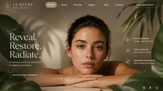
How to Design a Homepage That Converts in the First Five Seconds
The layout, hierarchy and proof decisions that turn cold traffic into qualified leads in seconds.
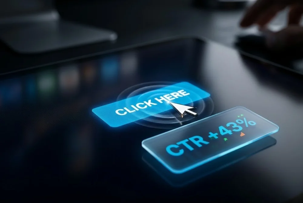
The call to action is the hinge of every page. You can earn attention and build interest, then lose the conversion because the button is vague, hidden, or asking for too much.
This guide covers the wording, placement and design choices that make a call to action pull its weight, with examples you can apply to any page today.
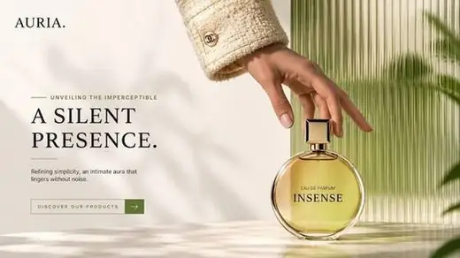
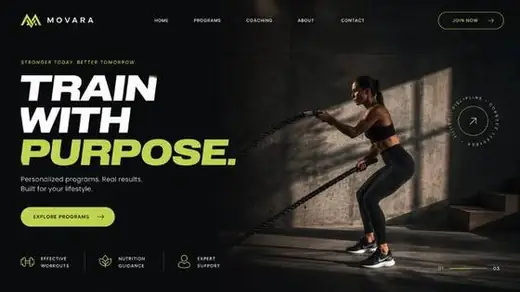
A call to action people click states the value the visitor gets, uses first person or action language, stands out with strong contrast, and appears at the moment of intent. Replace generic labels like submit with specific outcomes such as get my free quote.
Submit, send and learn more describe the mechanic of clicking, not the reward. Strong button copy names what the visitor gets on the other side.
First person framing often lifts clicks because it puts the visitor in the action. Test it against second person and keep the winner.
Every call to action carries a perceived cost in time, money or risk. Lower it with the words around the button. A short reassurance such as no card required, takes two minutes, or cancel anytime removes the hesitation that stops a click.
The button promises the reward, the supporting line removes the friction. Together they make saying yes feel easy.
A call to action only works if the eye finds it instantly. Give the primary button a colour that appears nowhere else nearby, surround it with whitespace, and make it visibly larger than secondary links.
If everything on the page shouts, nothing does. Quiet the surrounding elements so the one action you want is the obvious next move.
Put the call to action where desire peaks: right after the value is clear and again after proof. On long pages, repeat it so the visitor never has to scroll back to act.
Match the message to the stage. A cold visitor at the top may prefer see how it works, while a warm visitor near the testimonials is ready for get started.
There is no universal best colour. The button should contrast strongly with everything around it so it is the most prominent element. On a dark page a bright accent works, on a busy page a single saturated colour reserved only for the button performs best.
One primary action, repeated as needed. You can include quieter secondary links, but multiple competing primary buttons split attention and lower conversion. Decide the single most valuable action and lead with it.
First person, such as start my free trial, often outperforms second person because it frames the action from the visitor's point of view. It is worth testing on your own audience, since results vary by context.
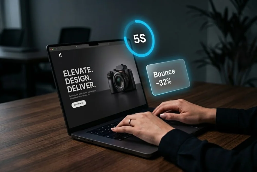
The layout, hierarchy and proof decisions that turn cold traffic into qualified leads in seconds.
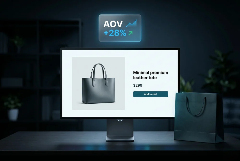
How product page design, merchandising and trust signals lifted average order value.
From first sketch to launch day, we design sites that look unforgettable and convert like they mean it.